Brand Identity
Rabadans
Brand Identity and packaging design for a craft brewery (AO) – 2025
Ther’s a new brew in the Valley…
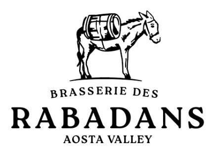
We had the pleasure to work with the guys at Rabadans, a small craft brewery from Valle d’Aosta, in the restilyng of their brand image and the creation of the new line of bottles for their amazing beers. Rabadan it’s a colloquial northern-italian term to define someone who’s messy and unruly in their way of life, so we were absolutely on board with keeping the donkey, who stubbornly carries the beer barrell, which they invisioned as a nice synthesis of their values in their previous logo mockups.
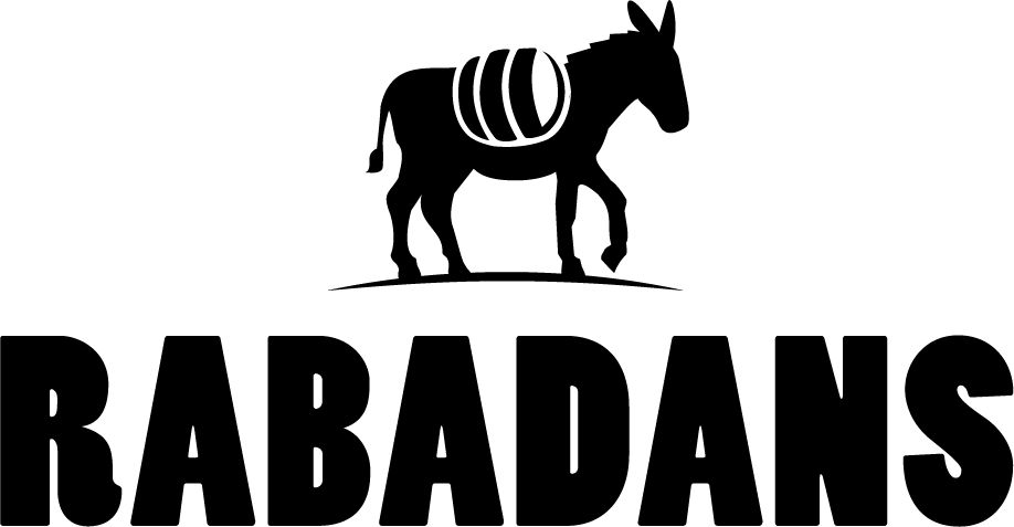
We used that as a base to create a new logo, simplifying the shapes to give it a younger and fresher appeal, and improve the scalability and readability of it. We also oted for a a bolder and rounder typeface to better match the new style.
OLD LOGO
NEW LOGO
TLDR
We took care of the brand restyling and lable design for Rabadans, a small craft brewery from Val d’Aosta.
The beers
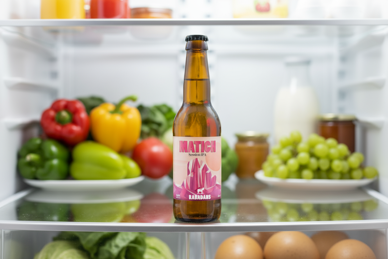
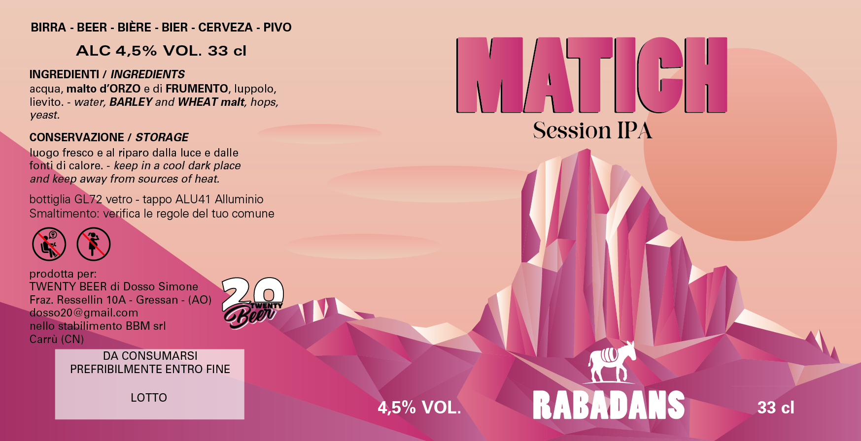
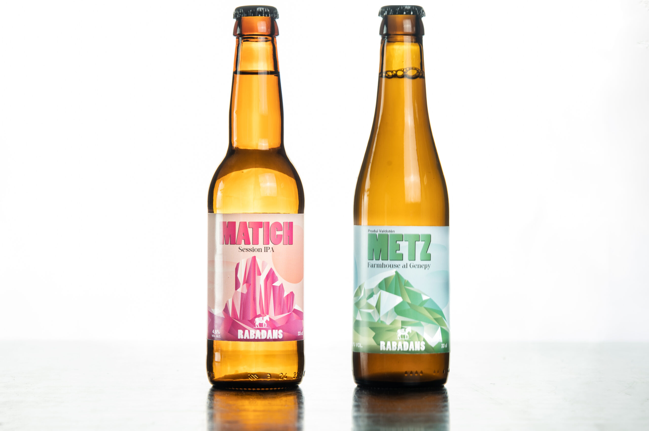
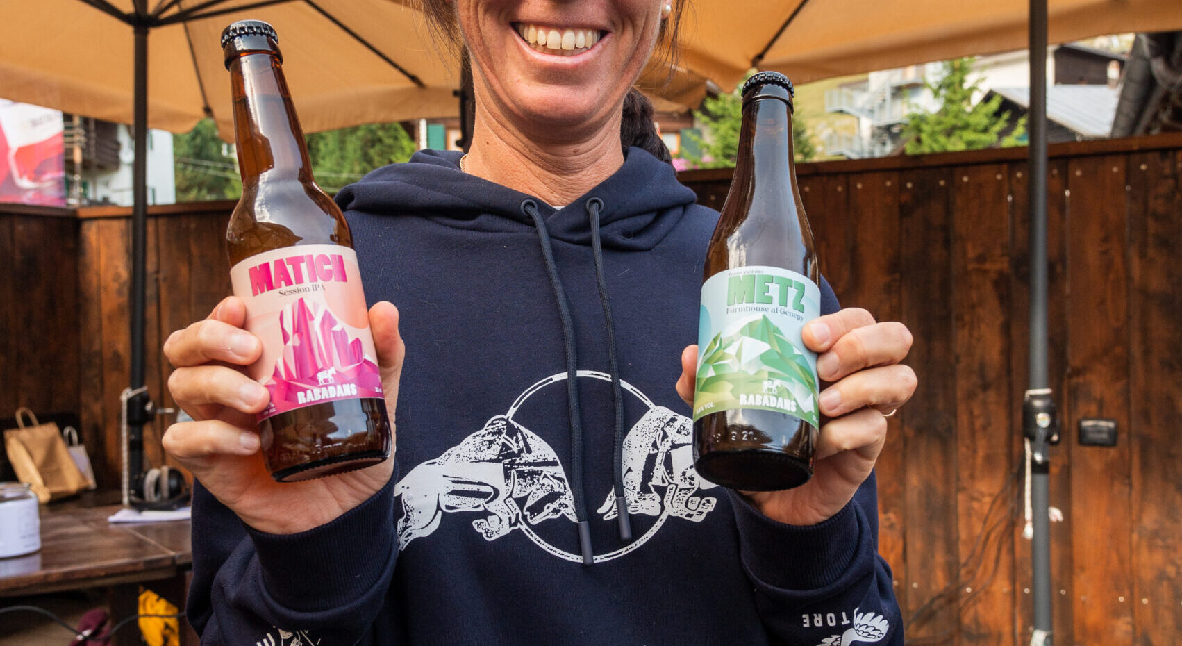
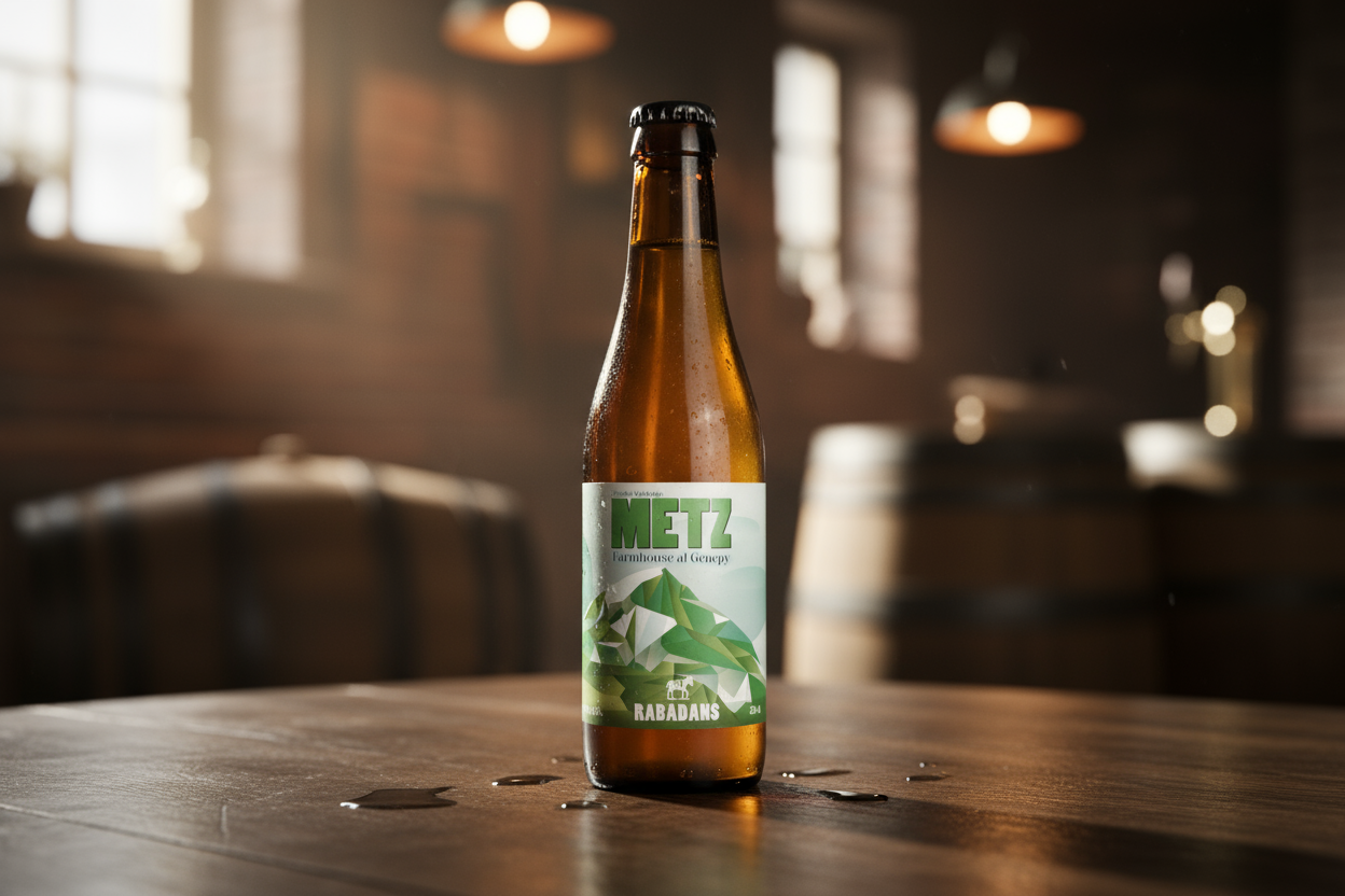
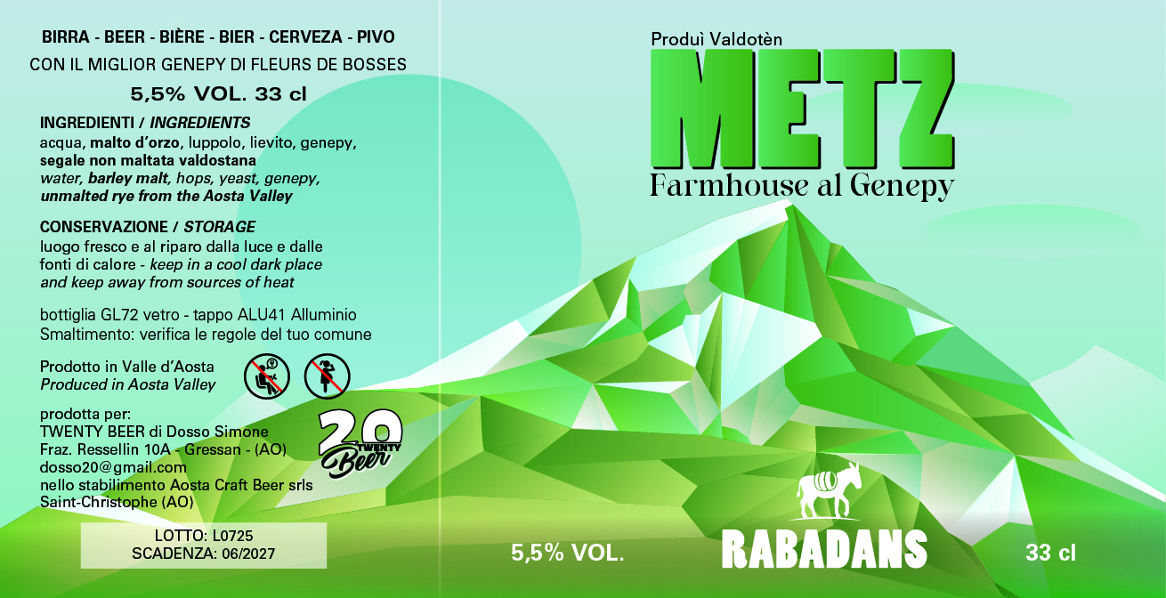
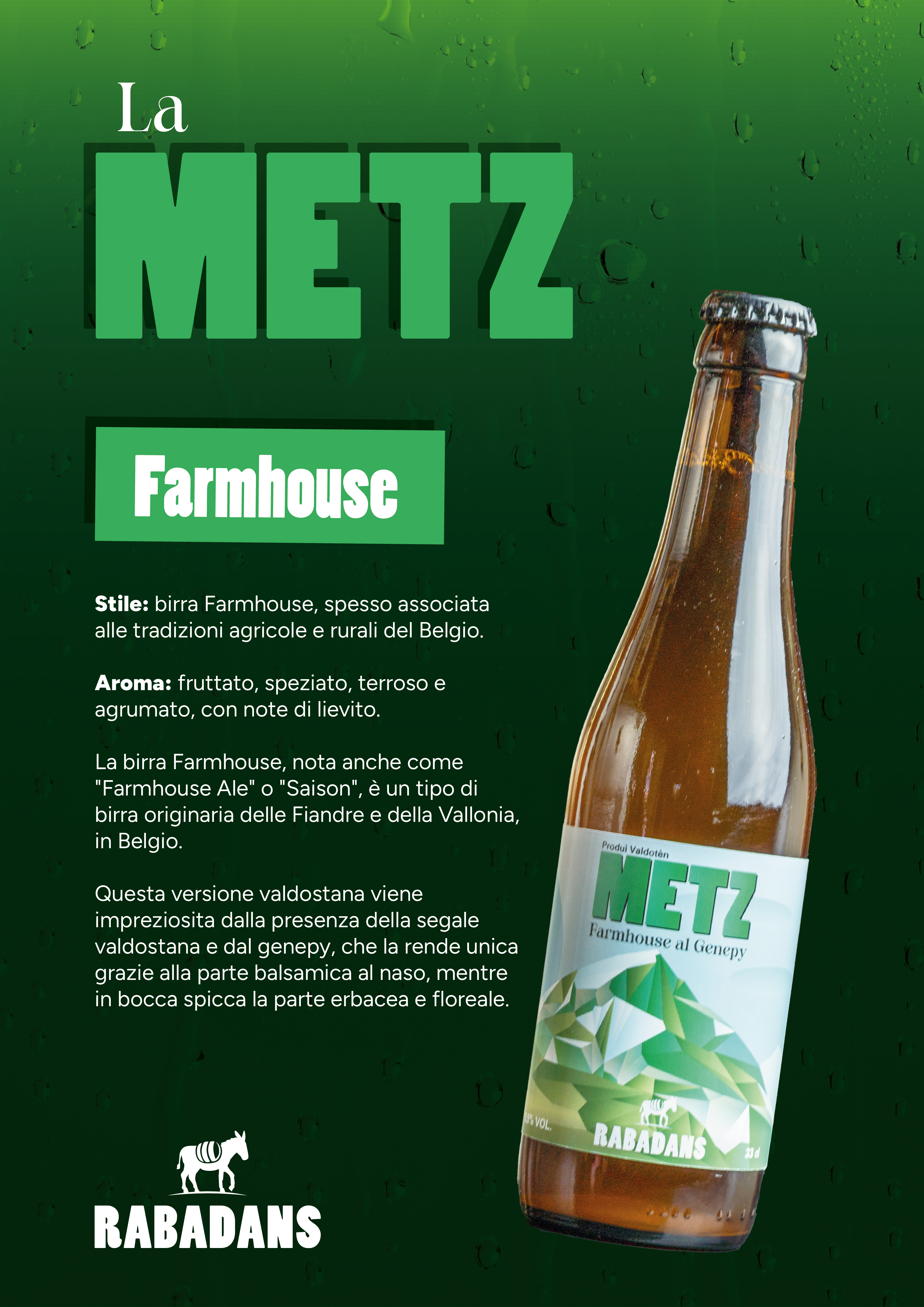
We designed two lables for the new line of beers they launched with the rebranding, “METZ” and “MATICH”. The beer names are insired form mostly uknown peaks and mountais in the region, so we used that as a base to create this line of lables which represent for each beer the corrisponding peak, and stylized them using a shard-like aesthethic, to make them look more modern and better stand out in the craft beers fridge at your local pub.
METZ
Farmhouse al Genepy
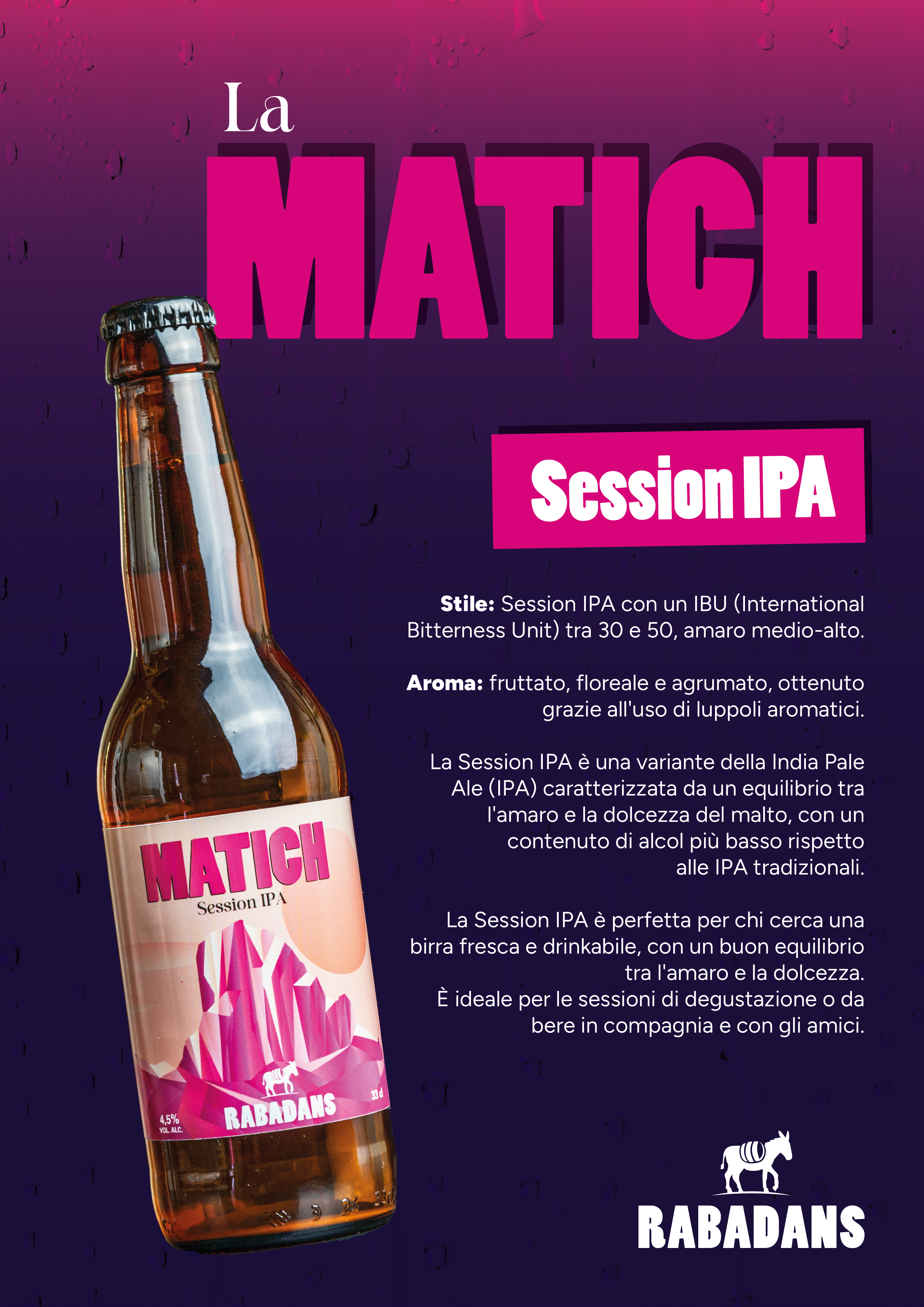
MATICH
Session IPA